

Textured Divide Original: A Quiet Diptych Built on Surface
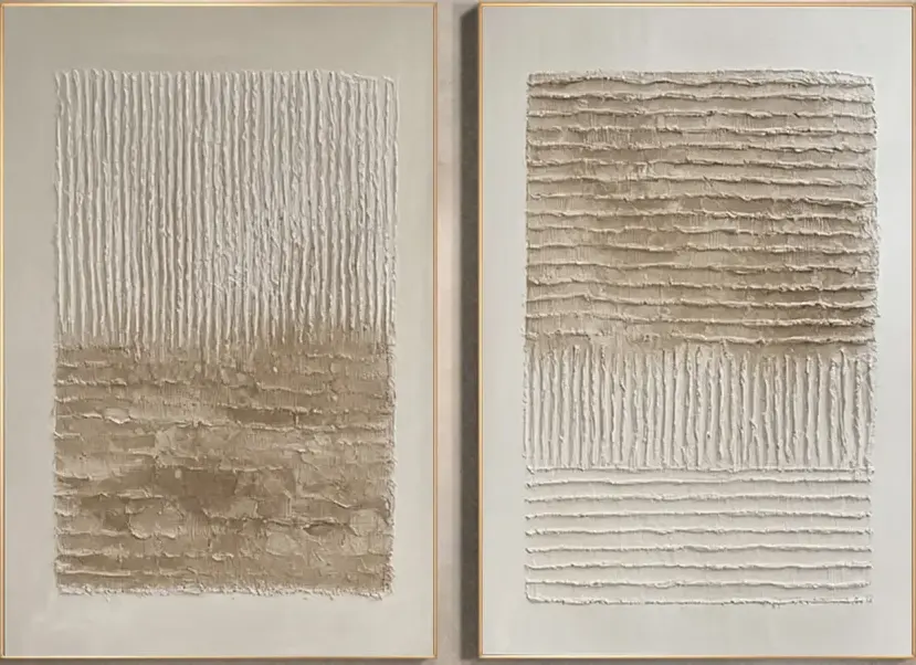
Textured Divide Original is a two-panel, hand-painted canvas artwork with a heavy plaster-like relief. Its palette stays close — bone, sand, warm grey — while the surface does the visual work, shifting between tight vertical striations and coarser horizontal bands. It suits living rooms, dining rooms, and foyers styled in Japandi, minimalist, or wabi-inspired directions, especially around light oak and linen.
Quick read
Surface, not color, carries the composition.
Product reference
Textured Divide Original is a two-panel, hand-painted canvas piece that leads with surface. At first glance, it reads almost like sculpted plaster: dense vertical grooves on one panel, coarse horizontal bands on the other, all worked into a soft, close-toned ground of bone, sand, and warm grey. There is no bright accent, no drawn subject. The composition is carried entirely by ridge, shadow, and the quiet horizon line where the texture shifts.
That restraint is the point. It is a neutral abstract painting that behaves more like architecture than decoration — something you notice for its material, then keep noticing as the light changes across the day.
How the diptych reads on a wall
The left panel moves from tight ivory striations at the top into a rougher, sand-toned lower field. The right panel flips that logic: coarse horizontal bands settle above fine vertical grooves, closing on a final row of level lines. Hung side by side with a narrow gap between them, the two panels talk to each other. Vertical answers horizontal. Smooth answers coarse. The eye travels between them instead of resting on one focal point.
Because the palette stays so close, the piece is genuinely responsive to light. Under daylight, the ridges throw fine shadows and the sand tones warm up. Under lamplight, the surface softens and the whole wall feels quieter. That behavior is part of what separates a hand-painted textured canvas from a flat print — the relief is doing real work.
Where it fits, and where it doesn't
This diptych is built for pared-back, texture-forward interiors. It slots naturally into Japandi rooms, contemporary wabi-inspired spaces, and minimalist homes that favor material over ornament. Around light oak, warm white linen, and raw wood furniture, the tones read as a continuation of the room rather than a contrasting statement.
It is less at home in high-color, high-pattern rooms. If your sofa is jewel-toned, your rug is graphic, and your walls carry other bold art, this piece will get drowned out — its whole language is subtlety. Buyers sometimes assume neutral wall art is a safe default for any room. It isn't. Neutral, textured work like this needs breathing room and quiet neighbors to actually be seen.
How it compares to nearby options
Against a single large abstract canvas, the diptych format gives you more architectural rhythm — two panels create a built-in composition on the wall, which tends to feel more considered above a long sofa or console. Against a framed print with visible brushwork, the plaster-like relief here reads as more tactile and more crafted, closer to a wall object than a picture.
Compared to darker wabi-sabi pieces, Textured Divide Original stays lighter and airier. It grounds a wall without weighing it down, which is useful in rooms with modest ceiling height or limited natural light.
A short styling scenario
Picture a living room with a low, linear sofa in warm white linen, a light oak coffee table, and a jute rug. The wall behind the sofa is bare and slightly too wide for a single canvas. Hang the diptych with a narrow gap — a few inches — so both panels sit centered above the sofa. The vertical grooves echo the legs of the coffee table; the sand tones pick up the rug. Add one ceramic lamp with a linen shade nearby, and the wall stops feeling empty without turning loud.
Product details
- Format: Diptych, two hand-painted canvas panels meant to hang together
- Technique: Hand-painted with heavy plaster-like relief; vertical and horizontal ridge work
- Palette: Bone, sand, warm grey — close-toned neutrals throughout
- Finish: Matte, hand-worked surface that shifts subtly under changing light
- Style direction: 3D textured, wabi-sabi, abstract
- Best rooms: Living room above a low sofa, dining room facing the table, foyer opposite the entry door, bedroom, home office
- Pairs with: Light oak, warm white linen, raw natural wood
- Sizes: Available in linked size options — check the product page for current dimensions
For rooms that lean quiet and material-driven, this diptych gives the wall something to say without raising its voice. See full sizing, panel details, and current availability on Textured Divide Original.