

Textured Green Mountain Layers: A Quiet Triptych With Real Weight
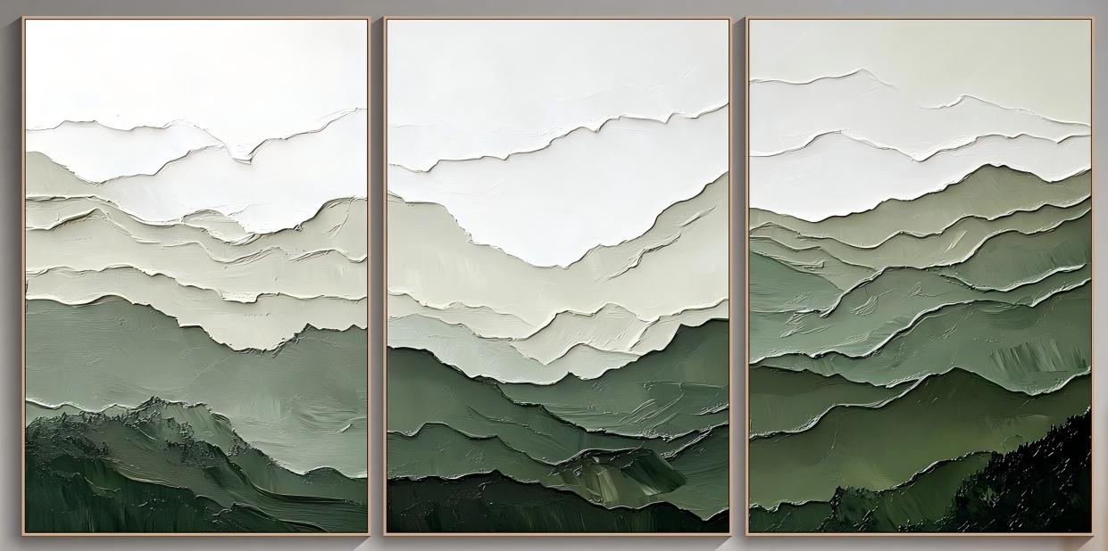
This triptych reads as one continuous horizon painted in sage, olive, and ivory, with raised ridges that catch light through the day. It suits long walls above sofas, consoles, or dining banquettes, and works best in calm, neutral interiors that want a focal piece without visual noise.
Quick read
A layered mountain view painted in weight, not in detail.
Product reference
The first thing you notice about Textured Green Mountain Layers isn't the color — it's the surface. Three panels carry a single ridge line across a wide horizontal span, and the mountain contours sit physically raised off the canvas in thick, plaster-like impasto. From a few feet back, it reads as a calm, layered landscape. Up close, it behaves more like a low-relief sculpture painted in sage, olive, and ivory.
The palette moves from a pale, open sky at the top of each panel into deepening bands of green, compressing into near-black weight along the bottom third. Negative space gathers overhead. Density collects underneath. That vertical rhythm is what gives the piece its stillness, even at scale.
What Kind of Wall Art This Actually Is
This is a hand-painted textured triptych — a three-panel landscape built in heavy acrylic impasto rather than printed. The subject is abstracted mountains, but the real language of the piece is texture: ridgelines raised in thick strokes, edges that catch daylight unevenly, and a matte, chalky finish closer to plaster than to gloss paint.
Because the panels repeat a related (not identical) ridge motif, the eye reads them as one continuous view seen through shifting light. That's what keeps a triptych from feeling like three separate pictures hung near each other.
How It Reads in a Room
In a living room, hung above a low sofa or media console, the horizontal spread lets the seating area breathe underneath it. The dark green base anchors the furniture line, while the ivory sky keeps the upper wall from feeling heavy. It behaves as a focal piece without dominating the room — closer to architecture than decoration.
Daylight and lamplight change it noticeably. In morning light, the ridges throw soft shadows and the greens look cooler and more sage. Under warm evening lamps, the olive tones deepen and the texture becomes more pronounced. If your room has a west-facing window or a nearby floor lamp, expect the piece to shift character across the day.
Who It Suits — and Who It Doesn't
This works for buyers leaning into calm, neutral interiors: light oak, walnut, warm taupe, unbleached linen, boucle, matte ceramics. It sits comfortably inside Japandi, modern organic, quiet-luxury, and transitional directions.
It's a less natural fit for high-contrast, high-saturation rooms, or spaces already carrying a lot of pattern. If your sofa is bold, your rug is graphic, and your walls are a strong color, a textured landscape like this can start to compete rather than settle.
One common misread: people assume a green triptych will only work in a "green room." In practice, the ivory and sage read as neutrals against warm woods and off-white walls. It doesn't require a matching palette — it needs a quiet one.
How It Compares to Nearby Options
Against a flat printed canvas of similar subject matter, the difference is physical. A print gives you image; this gives you surface. Against a single large abstract, the triptych format spreads visual weight along the wall instead of concentrating it in one square. And against a black-and-white minimalist landscape, this piece brings more warmth and more organic movement, without sliding into color-heavy territory.
If you're deciding between a bold statement painting and something quieter, this sits firmly on the quieter side — textured enough to hold a large wall, restrained enough to live with long term.
A Quick Styling Scenario
Picture a 10-foot living room wall behind a low, oatmeal-colored sofa. A walnut console sits to one side, a tall dried branch arrangement on the other. The triptych hangs centered above the sofa with roughly 6–8 inches between panels. Two matte black sconces frame it. The room reads calm, layered, and intentional — no gallery wall required.
Product Details
- Format: Hand-painted three-panel triptych on canvas
- Style: Abstract textured landscape, 3D impasto surface
- Palette: Ivory, sage, olive, deep forest green
- Finish: Matte, plaster-like texture with raised ridgelines
- Sizes: Available in linked triptych sizing for long-wall placement
- Best rooms: Living room, dining room, foyer, home office, bedroom
- Placement: Above a low sofa, media console, sideboard, or dining banquette on a wide wall
- Pairs with: Light oak, walnut, warm taupe, linen, matte ceramics
If your wall is long, your palette is quiet, and you want texture doing the heavy lifting, take a closer look at Textured Green Mountain Layers.