

A Quiet Grid: Living With Textured Grid Relief Quiet Order
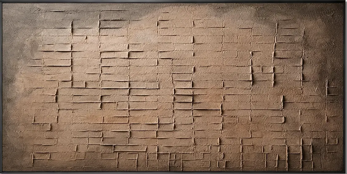
Textured Grid Relief Quiet Order is a hand-painted abstract canvas built on a dense grid of carved rectangular forms across a warm sienna and umber field. The surface is raised, plaster-like, and tactile, catching light unevenly and behaving almost like an architectural fragment on the wall. It suits rustic modern, Japandi, and wabi-inspired rooms where warmth and material honesty matter more than high contrast.
Quick read
A grid that behaves less like a pattern and more like a surface.
Product reference
The first thing you notice about Textured Grid Relief Quiet Order is that it doesn't behave like a painting. It behaves like a surface. A dense grid of carved rectangular blocks spreads edge to edge across a warm sienna and umber ground, and light lands on it the way it lands on a plaster wall — pooling in the recessed channels, catching the raised edges, shifting through the day.
It's a hand-painted abstract canvas, but the visual language is closer to architecture than to brushwork. Rows compress in some places and stretch in others. The palette moves from a pale clay center out toward deeper bronze and charcoal at the corners, giving the composition weight without any illusion of depth.
How It Reads in a Room
On the wall, it feels grounded rather than decorative. The tonal shift from center to edge gives it a natural focal pull, but the texture keeps it from feeling loud. It's the kind of piece that quiets a room instead of activating it — closer to a stone panel or an aged tablet than a graphic print.
In daylight, the grid softens and the color warms. Under lamplight, the recessed lines deepen and the surface starts to look sculptural. That shift is part of what people are actually buying with a textured canvas: it doesn't stay the same all day.
Who It Suits
This piece fits interiors built around warm neutrals and honest materials — rustic modern, Japandi, and contemporary wabi-inspired spaces in particular. It sits comfortably alongside walnut, aged leather, warm terracotta, linen, and unfinished wood. In rooms leaning cool, glossy, or high-contrast, it will feel out of key.
It works best as a primary wall piece rather than part of a gallery arrangement. The texture and tonal gradient want room to breathe. Crowding it with smaller frames tends to flatten the effect.
Realistic Expectations
Because the surface is built up rather than brushed, the piece carries real physical presence. Photos tend to under-sell the depth — the incised lines and raised edges read more clearly in person. Color-wise, expect warm earth tones with subtle variation, not a bold statement palette. If you're looking for a canvas that pops from across the room, this isn't it. If you're looking for something that rewards a closer look and settles a wall, it is.
A common mistaken assumption: that a grid composition will feel rigid or repetitive. In practice, the irregular spacing and the tonal fade keep the rhythm alive, and the eye doesn't lock onto any single row.
A Styling Scenario
Picture a low leather sofa in a living room with a walnut console nearby, a jute rug underfoot, and a warm floor lamp in the corner. Hung centered above the sofa, the canvas picks up the leather's patina and the wood's grain without matching either. In the evening, with the lamp on, the relief lines cast small shadows and the wall reads almost like textured stucco. It's a supporting anchor more than a spotlight — which is usually what a sofa wall actually needs.
Comparing It to Nearby Options
Against a flat printed abstract, this piece trades color drama for material depth. Against a large monochrome canvas, it offers more visual rhythm without adding contrast. And against a framed graphic print, it feels more like part of the architecture and less like a hung image. That's the tradeoff worth understanding before choosing it.
Product Details
- Type: Hand-painted textured canvas wall art
- Style: Abstract, 3D textured, wabi-sabi
- Palette: Warm sienna and umber, fading to deeper bronze and charcoal at the corners
- Surface: Plaster-like relief with incised grid lines; tactile, built up rather than brushed
- Best rooms: Living room above a low sofa, dining room behind a long wooden table, foyer at eye level
- Pairs with: Walnut furniture, aged leather, warm terracotta, woven textiles, unfinished wood
- Best as: A single primary wall piece rather than part of a gallery wall
If your rooms lean warm, quiet, and materially honest, this is the kind of piece that settles in without asking for attention — see Textured Grid Relief Quiet Order for the full piece.