

Ridgelines in Relief: The Story Behind Textured Mountain Landscape Descent
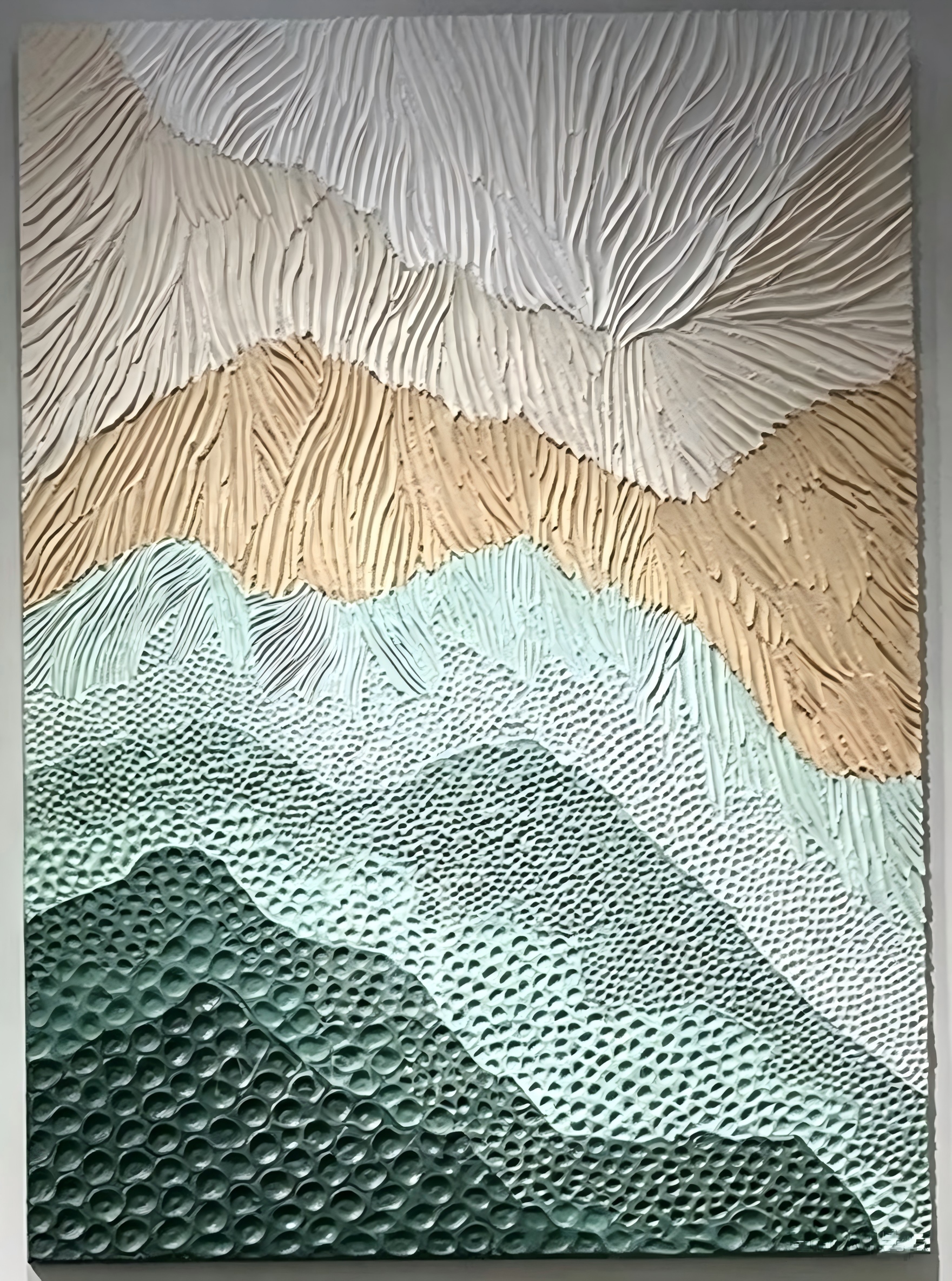
This piece is built up in real, sculpted texture rather than printed illusion. Ridgelines move from combed white and sand at the top to dotted teal and deep forest green at the base, giving the canvas a tactile, landscape-like rhythm that shifts with the light. It suits Japandi, Scandinavian, and wabi-inspired rooms where the wall is meant to be looked at, not just filled.
Quick read
A quiet, sculpted landscape that trades bold contrast for slow color and real surface depth.
Product reference
The first thing you notice about Textured Mountain Landscape Descent is that the surface is actually built up. Ridges of paint sit in low relief across the canvas, casting their own soft shadows and shifting as the light in the room changes. It reads less like a picture of a landscape and more like a landscape rendered directly in material.
The composition moves top to bottom in bands. Combed white and warm sand at the top give way to a middle register of ochre striations, then settle into pebbled teal and deep forest green at the base. Nothing snaps between colors. The palette eases from warm neutrals into cool greens, so the whole canvas feels like a slow descent rather than a hard horizon line.
What Makes This Piece Visually Distinct
Most textured wall art relies on one surface technique repeated across the canvas. This one changes its language as it moves down the composition. Long vertical striations at the top feel like brushed stone or wind-carved ridges. The middle band reads warmer and more sculpted. The lower half turns dotted and pebbled, closer to riverbed than mountain.
That shift is what gives the piece its quiet drama. Tension collects where the warm upper register meets the cool green below, then releases as the greens deepen toward the base. It's a landscape you read with your eyes and, honestly, want to run a hand across.
How It Feels in a Room
In daylight, the ridges catch highlights and the color transitions look softer, almost washed. Under warm lamplight in the evening, the relief deepens and the surface gets more sculptural. That change is part of the appeal — the piece doesn't look identical from morning to night.
It leans calm rather than loud. There's no dominant focal point competing for attention, so it works as a slow, grounding presence on a wall instead of a graphic statement. Rooms with light oak, warm white linen, or soft sage upholstery tend to pick up its palette naturally.
Who It Suits
This is a good fit for Japandi, Scandinavian, and contemporary wabi-inspired interiors — spaces that already lean into muted color, natural materials, and a certain quietness. If your room runs high-contrast, glossy, or heavily patterned, this piece will feel out of step. It wants breathing room around it.
It's also the kind of artwork that rewards distance. On a dining room end wall or across a living room, the color banding reads clearly and the texture becomes atmospheric rather than detailed.
A Realistic Styling Scenario
Picture a living room with a low, linear sofa in warm white linen, a light oak coffee table, and a soft wool rug in oatmeal. The wall above the sofa is currently empty and feels tall. Hung centered above the sofa, this piece fills that vertical space without crowding it — the upper neutrals blend into the wall, while the green base visually connects down toward the rug and floor. The room reads finished, but still quiet.
The same logic works behind a low headboard in a bedroom, where the horizontal banding echoes the calm of a made bed, or above a wood sideboard in a dining room, viewed from across the table.
Common Mistaken Assumptions
A few things worth knowing up front. This isn't a print with a textured coating — the relief is real, hand-built paint, so the surface has genuine depth and small variations from piece to piece. It's also not a bold, high-contrast statement work. If you're looking for something graphic to anchor a maximalist wall, this isn't that piece. Its strength is atmosphere, not impact.
Product Details
- Type: Hand-painted textured canvas, low-relief surface
- Style direction: Abstract landscape, 3D textured, wabi-sabi
- Color palette: Combed white, warm sand, ochre, teal, deep forest green
- Surface finish: Sculpted ridges and pebbled texture; matte, tactile feel
- Best rooms: Living room, bedroom, dining room, foyer, home office
- Placement notes: Above a low sofa, behind a low headboard, on a dining end wall above a wood sideboard
- Pairs well with: Light oak or ash wood, warm white linen, soft sage upholstery
For rooms that reward a second look, explore Textured Mountain Landscape Descent to see how its sculpted ridgelines and slow color descent could sit on your wall.