

Quiet Terrain: A Textured Diptych That Reads Like Relief
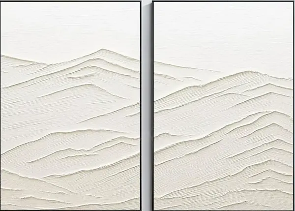
The Textured Mountain Landscape Diptych is a pair of ivory-toned, hand-painted canvases where mountain ridges are shaped in raised, directional strokes. It reads as one continuous terrain split by a narrow gap, staying inside a bone-and-chalk palette so texture carries the composition. It suits neutral, material-forward rooms and works well above a low sofa, a long dining wall, or as a single panel in a foyer.
Quick read
Form emerges through texture, not color — the ridges do the talking.
Product reference
The Textured Mountain Landscape Diptych looks, at first glance, less like a painting and more like a low relief carved into canvas. Two ivory panels sit side by side, each holding a stretch of ridged terrain built up in thick, directional strokes. The palette barely shifts — bone, chalk, warm white — so what you actually read across the wall is light catching texture, not color doing the work.
That is the core of the piece. It is a hand-painted, sculptural landscape that behaves more like architecture than illustration. The peaks aren't drawn; they're built.
What it actually looks like in a room
Hung together, the two panels form a continuous ridge line broken by a quiet vertical gap. The eye reads across it the way you'd read across a horizon. From a few steps back, the surface feels calm and almost monochromatic. Move closer and the plaster-like layering takes over — stacked strokes near the base, softer flatness toward the top where the sky sits.
In daylight, the piece looks airy and matte. Under lamplight or a wall sconce, the ridges throw small shadows and the texture sharpens. That shift is part of the appeal, and worth planning for when you pick the wall.
Who this piece is really for
This is wall art for people who are already leaning neutral. If your room runs on light oak, raw linen, warm white walls, and matte ceramics, a textured diptych like this adds visual weight without introducing a new color story. It sits naturally inside Scandinavian, Japandi, and quiet minimalist interiors, where material and finish do most of the styling.
It is not the right piece if you want a graphic focal point, a saturated color moment, or a bold contemporary print. The composition is intentionally restrained. It rewards a room that already has good light and calm surroundings.
How it compares to other landscape wall art
Most neutral landscape art in this category falls into two camps: soft, atmospheric prints that fade into the wall, or high-contrast abstract canvases that dominate it. This diptych sits in a third lane. It has real physical presence because of the built-up texture, but it stays tonal, so it doesn't fight the furniture below it.
Compared to a single large canvas, the two-panel format gives you flexibility. You can hang the panels tight for a unified horizon, space them slightly for rhythm, or split them across two walls in a hallway and entry.
A quick styling scenario
Picture a living room with a long, low sofa in oatmeal linen, a light oak coffee table, and a jute rug. The wall behind the sofa is warm white and mostly empty. Center the diptych above the sofa at roughly 6 to 10 inches above the backrest, panels hung close together. The horizontal ridge lines echo the line of the sofa, and the whole seating area suddenly reads as composed rather than under-decorated. No new color needed.
In a dining room, run it along the length of a table wall at standard eye level. For a narrow foyer, a single panel viewed straight-on near the entry does the same quiet work without crowding the space.
Product details
- Format: Two-panel diptych, hand-painted on canvas
- Finish: Heavy 3D texture, plaster-like ridges, matte surface
- Palette: Ivory, bone, chalk, warm white — narrow tonal range
- Style direction: Abstract landscape, minimalist, sculptural
- Sizes: Linked sizing across both panels so the pair scales together
- Framing: Sold as canvas panels; frame choice can lean thin black, natural oak, or unframed for a rawer feel
- Best rooms: Living room above a low sofa, dining room table wall, foyer, primary bedroom, home office
- Pairs well with: Light oak wood, warm white linen, raw natural textiles, matte ceramics
Realistic expectations
Because the texture is built up by hand, small variations between panels are part of the piece — the ridge rhythm shifts slightly from left to right, which is what makes the diptych read as continuous terrain instead of a mirrored pair. Colors stay inside a tight neutral range and will look softer in daylight and more sculptural under directional lighting.
If your room already speaks in wood grain, linen, and matte white, this piece slots in without raising its voice. Explore the full piece here: Textured Mountain Landscape Diptych.