

Twin Peaks in Plaster: A Textured Mountain Diptych That Reads Like Topography
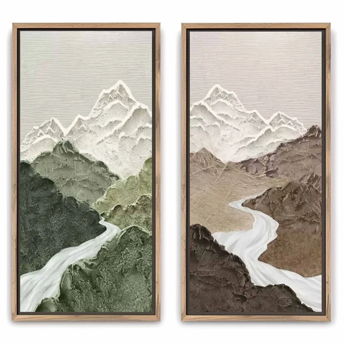
This piece pairs two vertical hand-painted canvases showing the same aerial mountain composition in contrasting earth tones. Sculpted plaster ridgelines, a pale carved river, and smoother valley floors give it the feel of topography rather than illustration. It works as a calm focal point in living rooms, dining rooms, and foyers, and reads especially well in Scandinavian, Japandi, and wabi-inspired interiors.
Quick read
Two panels, one mountain, two moods — a quiet study in paired variation.
Product reference
Piece: Textured Mountain Landscape Twin Rivers
Format: Hand-painted
Size family: linked
View the productAt first glance, Textured Mountain Landscape Twin Rivers looks less like a painting and more like two slices of terrain lifted onto canvas. Two vertical panels hold the same aerial mountain composition, but one leans into muted sage and moss green while the other shifts to warm taupe and clay brown. A pale river carves a soft diagonal through each ridge line, pulling the eye from the lower foreground up to snow-capped peaks built in raised, plaster-like relief.
The surface does most of the talking. Deep grooves mark the ridgelines, the valley floors stay smoother, and light catches unevenly across the built-up passages, so the artwork reads differently in morning sun than it does under a warm evening lamp.
What Makes This Diptych Visually Distinct
Most mountain wall art leans illustrative — painted peaks, printed skies, a clear horizon line. This one behaves more like sculpted topography. The composition is stripped of sky and background noise, leaving the terrain itself to carry the piece. Because both panels share the same underlying silhouette, they create paired variation rather than mirror symmetry. Your eye moves between them looking for differences, and finds them in tone rather than shape.
That restraint is what keeps the work from feeling decorative in a heavy-handed way. It sits closer to a textural relief than a landscape print.
How It Feels in a Room
The mood is grounded and quiet. Neutral, earth-driven color keeps it from competing with furniture, while the sculpted surface gives the wall physical presence — something you notice from across the room and again up close. In daylight, the ridgelines throw small shadows that shift through the day. Under lamplight, the raised texture warms up and the brown panel especially takes on more depth.
It works as a focal point above a low sofa, but it doesn't demand attention the way a bold graphic print would. Think of it as a textural anchor rather than a statement piece in the loud sense.
Who It Suits
This diptych belongs in rooms already leaning toward natural materials and calm palettes. It reads especially well with:
- Scandinavian interiors built on light oak, linen, and off-white walls
- Japandi spaces that mix low furniture, matte ceramics, and warm neutrals
- Contemporary wabi-inspired rooms where imperfection and texture are the point
If your space runs high-contrast, glossy, or heavily patterned, the subtle tonal shift between the two panels can get lost. It rewards restraint around it.
Common Assumptions Worth Adjusting
A few things buyers often misjudge with textured diptychs like this one. It isn't a matched mirror pair — the panels are close but not identical, and that's intentional. It also isn't a small accent; because it lives as two vertical canvases, it needs real wall real estate to breathe. And while it photographs as a green-and-brown piece, in person the neutrals do more of the work than the color does.
How It Compares to Nearby Options
Against a flat printed mountain canvas, this piece trades crisp detail for dimensional presence. Against a single oversized landscape, the diptych format gives you more flexibility — you can hang the panels together for maximum impact, or split them between a bedroom and home office if the pair needs separating later. Compared to fully abstract textured art, the recognizable mountain silhouette gives the eye something to land on, which tends to make it easier to live with long term.
A Real Styling Scenario
Picture a living room with a low, linen-upholstered sofa in warm taupe, a light oak coffee table, and a woven rug in soft sand. Hang the two panels above the sofa, spaced a few inches apart and centered on the wall. The green panel picks up any sage textiles in the room; the brown panel echoes the oak and the upholstery. The sofa stays the anchor, but the wall finally has weight.
In a dining room, the same pair reads well along the wall facing the table — something textural for diners to rest their eyes on between courses. In a foyer with tall ceilings, the vertical format runs alongside a narrow console and pulls the eye upward.
Product Details
- Format: Two-panel vertical diptych, hand-painted on canvas
- Style: 3D textured, organic modern, abstract landscape
- Surface: Raised plaster-like texture on ridgelines; smoother valley passages; carved river detail
- Color direction: Panel one in muted sage and moss green; panel two in warm taupe and clay brown; snow-white peaks and river across both
- Best rooms: Living room above a low sofa, dining room along the main wall, foyer with vertical height; individual panels also suit a bedroom or home office
- Pairs well with: Light oak wood, warm taupe upholstery, soft sage textiles, matte ceramics
- Sizes: Available in linked size options — check the product page for current dimensions
For rooms built on natural texture and restrained color, this diptych settles in without ever going quiet. See the full piece and available sizes on Textured Mountain Landscape Twin Rivers.