

The Quiet Weight of a Plaster-Textured Neutral: Inside Quiet Divide
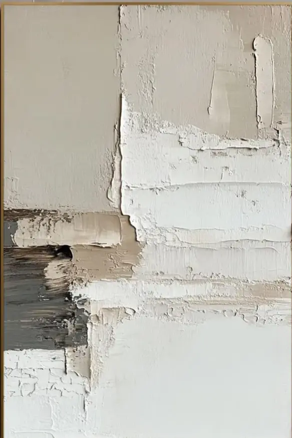
This piece reads as a calm, architectural neutral built from raised pigment, uneven horizontal registers, and a single dark passage in the lower left. It behaves more like a textured surface than a picture, which is why it fits minimalist, Japandi, and wabi-inspired rooms without taking them over.
Quick read
Nothing here insists on being looked at — it simply holds its ground.
Product reference
At first look, Quiet Divide reads less like a painting and more like a section of wall you'd want to keep. Ivory and warm putty blocks settle against a plaster-white ground, broken only by a charcoal and grey passage in the lower left. The edge of that dark area is feathered, not cut, so the contrast feels like weather rather than graphic design.
The surface is the real story. Raised ridges, dried troughs, and horizontal seams divide the canvas into uneven registers — some dense with built-up pigment, others left nearly bare. It's a hand-painted textured canvas that behaves like architecture: quiet, grounded, and dependent on light.
How It Reads in a Room
In daylight, the texture casts small shadows that shift through the day, giving the piece a slow, almost sculptural rhythm. Under warm lamplight in the evening, the cream and taupe tones deepen and the charcoal corner feels heavier, more anchoring. That shift is part of why it works in living rooms and bedrooms where you actually spend hours, not just pass through.
It's a focal piece, but a quiet one. It won't fight a bookshelf, a sculptural lamp, or a layered sofa arrangement. Think of it as a textured neutral that organizes a wall rather than decorating it.
Who It's For
This one suits buyers leaning minimalist, Japandi, or contemporary wabi-inspired. If your palette already runs through warm whites, oatmeal linen, light oak, and matte black metal, the piece slots in without adjustment. It's also a good answer for rooms that feel visually finished but flat — the plaster-like relief adds dimension without introducing a new color story.
It's probably not the right pick if you want a graphic statement, saturated color, or a clearly representational subject. The composition is restrained on purpose.
Common Misreads
Two things worth clearing up. First, "neutral" here doesn't mean flat or safe — the texture does a lot of visual work, and in person the surface is more sculptural than photos usually suggest. Second, the charcoal passage isn't a focal point in the traditional sense; it's a weight, a way of keeping the composition from floating. If you were hoping for a bold dark anchor front and center, this isn't that painting.
How It Compares
Against a smooth minimalist print, Quiet Divide feels warmer and more handmade — closer to a wall finish than a poster. Against a heavily impasto abstract with bright color, it reads calmer and more architectural. And compared to framed neutral prints, the hand-painted surface gives it presence that holds up at larger scale, where prints can start to feel thin.
A Styling Scenario
Picture a living room with a low, linear sofa in unbleached linen, a light oak coffee table, and a matte black floor lamp arcing overhead. The canvas sits centered above the sofa, its charcoal corner echoing the lamp base, the cream field blending into a warm white wall. Nothing in the room competes; everything settles. In a home office, the same piece faces the desk and quiets the field of view without pulling attention from the screen.
Product Details
- Type: Hand-painted textured canvas wall art
- Palette: Ivory, warm putty, greige, with a charcoal and grey passage
- Finish: Plaster-like relief with raised ridges, troughs, and horizontal seams
- Style direction: Minimalist, Japandi, wabi-inspired, contemporary neutral
- Best placements: Above a low sofa, centered over a console, behind a headboard, or facing a desk
- Pairs well with: Warm white linen, light oak, matte black metal, limewash or plaster walls
- Room fit: Living room, bedroom, home office, foyer, dining room
Variants may differ slightly in texture distribution and the exact shape of the charcoal passage, since each canvas is painted by hand — a feature of the medium rather than an inconsistency.
For rooms that already have their bones in place and just need a wall that holds its weight, consider Textured Neutral Abstract Quiet Divide.