

The Quiet Weight of White: Living With a Textured Neutral Abstract
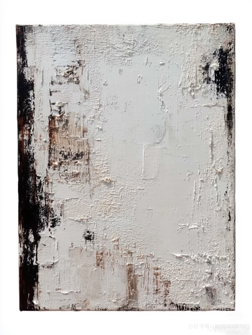
Textured Neutral Abstract Quiet Interval is a hand-painted canvas built up in thick, plaster-like layers of white and bone, framed on the sides by dark umber and charcoal streaks. It reads as calm but grounded, and works best above a low sofa, behind a headboard, or on a quiet office wall in minimalist, Japandi, and wabi-inspired rooms.
Quick read
A painting you notice for its surface first and its color second.
Product reference
The first thing you notice about Textured Neutral Abstract Quiet Interval isn't the color. It's the surface. Thick layers of plaster-like white and bone sit across the canvas in uneven ridges, catching light the way an old wall does. It looks built up rather than brushed, and that shift alone changes how the piece behaves on a wall.
Along the left edge, dark umber and charcoal streaks cut down through the pale field, giving the composition a clear vertical anchor. A smaller trace of that same darkness shows up on the right, creating a loose bracket around the softer center. Faint ochre stains gather near the bottom third, then dissolve upward into open ivory and warm gray. The result is quiet, but not empty.
How the Piece Reads in a Room
This is a textured neutral abstract painting, which in plain terms means a hand-painted canvas where the physical surface does most of the work. Color stays restrained. Contrast is limited to the darker edges. What carries the piece is dimension: shallow cracks, raised strokes, and the way daylight catches the ridges differently than a warm lamp does at night.
In daylight, the surface reads architectural, almost like a section of old plaster wall. Under lamplight, it softens and warms, and the ochre notes come forward. That shift is part of the appeal for people who want art that changes slightly across the day rather than staying flat.
Where It Actually Works
It's most at home above a low, linear sofa, centered on a main focal wall where the texture can breathe. Behind a low headboard, it adds visual weight to a plain bedroom wall without introducing pattern or strong color. In a home office, hung on the wall facing the desk, it gives the eyes something to rest on that isn't a screen or a shelf of clutter.
Tonally, it sits easily with light oak, raw linen, aged wood, and warm whites. Rooms leaning minimalist, Japandi, or contemporary wabi-inspired are the natural fit. It's less suited to high-contrast, high-gloss, or heavily patterned interiors, where the subtle surface work gets drowned out.
Focal Point or Supporting Piece?
At larger sizes, it can carry a wall on its own as a focal point. At smaller scales, it reads more as a textured supporting piece, something that adds depth next to a mirror, a console, or a pair of sconces. One realistic tradeoff: because the palette is quiet, it won't do the heavy lifting in a room that already feels visually flat. It rewards rooms with some material variety, such as linen, wood grain, ceramics, and stone, where the plaster surface has other textures to talk to.
Common Mistaken Assumptions
Some buyers expect a neutral abstract to disappear into the wall. This one doesn't. The dark edges and raised surface give it more presence than a printed neutral canvas of the same size. On the other hand, people sometimes assume heavy texture means heavy visual noise. Here it's the opposite: the composition stays calm, and the texture reads as material honesty rather than drama.
Compared with a flat framed print, it feels more like an object than an image. Compared with a bold black-and-white abstract painting, it's quieter, slower, and more about mood than statement.
Product Details
- Type: Hand-painted canvas, textured neutral abstract
- Palette: Ivory, bone white, warm gray, faint ochre, umber and charcoal accents
- Finish: Thick, plaster-like impasto with shallow cracks and raised ridges
- Style direction: Wabi-inspired, 3D textured, minimalist abstract art
- Best rooms: Living room, bedroom, home office, dining room, foyer
- Placement notes: Above a low sofa on a focal wall, behind a low headboard, or facing a desk on an uncluttered side wall
- Pairs with: Light oak, warm white linen, aged raw wood, stone and ceramic accents
A Quick Styling Scenario
Picture a living room with a low linen sofa, an oak coffee table, and a single ceramic lamp. The wall behind the sofa is bare and slightly too tall. Hung centered, about eight to ten inches above the sofa back, this piece fills that vertical gap with texture instead of pattern. The dark edges line up loosely with the sofa arms, and the ivory center opens the wall back up. Nothing else in the room has to change.
If you want to see how the surface and edge work carry across sizes, take a closer look at Textured Neutral Abstract Quiet Interval.