

Quiet Rows: A Hand-Painted Neutral That Reads Like Texture, Not Color
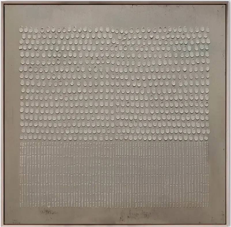
Quiet Rows is a hand-painted neutral abstract that trades color impact for surface presence. Rows of raised oval marks fill the upper field, giving way to lighter vertical strokes below, all across a soft grey-green ground. It suits living rooms, bedrooms, and home offices that lean minimalist, Japandi, or wabi-inspired, where texture and rhythm carry more weight than contrast.
Quick read
A neutral built from repetition — quiet, gridded, and unmistakably hand-worked.
Product reference
At first glance, Textured Neutral Abstract Quiet Rows reads less like a painting and more like a fragment of a plaster wall someone spent hours pressing by hand. Hundreds of small oval marks sit in tight rows across a soft grey-green ground, catching light in slight shifts of white and bone. About two-thirds down, the ovals give way to short vertical strokes, thinning the composition and leaving a clear horizontal pause between the two zones.
It's a piece defined by surface, not statement. The color stays quiet on purpose so the texture can do the talking.
What Makes It Visually Distinct
Most neutral abstracts lean on gesture — a sweep of beige, a smear of off-white, a suggestion of a horizon. This one works differently. The image is built through repetition: row after row of raised marks, closer to weaving or masonry than to brushwork. That approach gives the canvas a rhythm you can almost count, and a tactile presence that changes as daylight moves across it.
The soft grey-green ground reads warmer under lamplight and cooler in morning sun. Shadows pool under each oval, so the piece looks denser from the side and flatter head-on. It's a hand-painted canvas that rewards being seen up close as well as from across the room.
How It Feels in a Room
Quiet Rows is a calming, grounding piece rather than a graphic one. It doesn't fight for attention against a bold sofa or a strong rug. Instead it acts like a textured backdrop — the visual equivalent of a linen curtain or a plaster wall finish. In a room with a lot of soft materials (bouclé, oak, warm white linen), it locks the mood in place.
It works well as a focal point on a quieter wall, but it isn't a scene-stealer. If your room already has a strong pattern, a heavy artwork, or saturated color elsewhere, this piece will support rather than compete.
Who It's For
This one is aimed at buyers drawn to minimalist, Japandi, and wabi-inspired interiors — rooms that favor material honesty over decoration. If you gravitate toward light oak, taupe upholstery, unbleached linen, and low, horizontal furniture, the palette and rhythm will feel familiar.
It's less suited to maximalist or high-contrast rooms. Against a bold navy wall or next to a saturated painting, the subtle color story can flatten out and the texture stops carrying the same weight.
Realistic Expectations
A few things worth knowing before you commit:
- The color is quiet. Photos on a bright screen can make it look whiter than it reads in person, where the grey-green undertone is more present.
- Because it's hand-painted, the raised marks aren't machine-uniform. Small variations in spacing and height are part of the finish.
- It needs some breathing room. Crowding it with heavy frames or busy shelf styling on either side kills the effect.
How It Compares to Similar Pieces
Against a flat printed neutral abstract, Quiet Rows carries far more depth — the raised surface is the whole point. Compared to a heavy plaster-panel wall sculpture, it's lighter, more paintable in feel, and easier to hang with standard hardware. If you've been weighing a soft grey canvas print versus something more sculptural, this sits in between: hand-worked texture with the format and scale of a traditional canvas.
A Quick Styling Scenario
Picture a low, linen-upholstered sofa in warm white, a light oak coffee table, a jute rug, and a single ceramic lamp on a side console. Centered above the sofa, Quiet Rows anchors the wall without adding color noise. In the evening, lamplight catches the raised ovals and the piece quietly shifts — more shadow, more depth, more presence — without ever announcing itself.
Product Details
- Type: Hand-painted canvas wall art
- Style: Abstract; minimalist, 3D-textured, wabi-sabi
- Palette: Soft grey-green ground with white and bone raised marks
- Surface: Raised, tactile, plaster-like; light-reactive
- Composition: Dense field of oval marks above, shorter vertical strokes below, with a clear horizontal pause between
- Best rooms: Living room above a low sofa, bedroom behind an upholstered headboard, home office on the wall facing the desk, foyer, dining room
- Pairs well with: Light oak, warm white linen, soft taupe upholstery, ceramic and stone accents
For the full view, dimensions, and framing options, see Textured Neutral Abstract Quiet Rows.