

Quiet Terrain: A Textured Neutral Abstract That Softens the Room
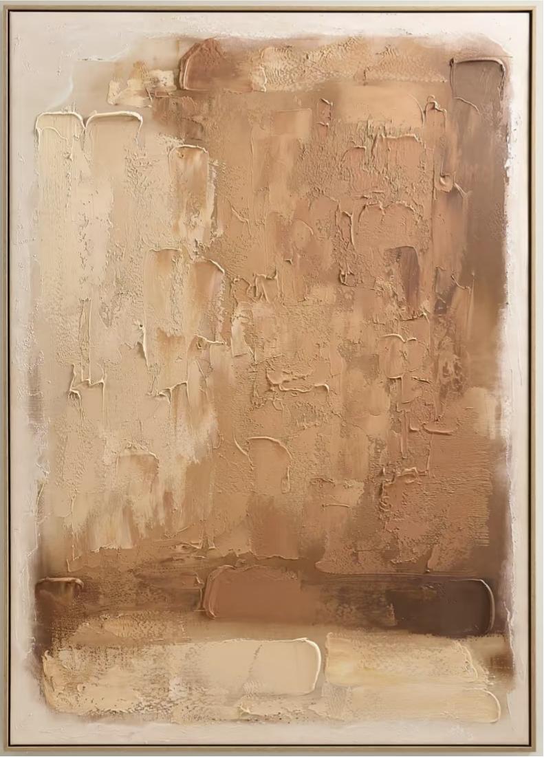
This piece reads as a warm, tactile abstract with vertical brushwork and a horizontal band near the base that anchors the composition. It suits living rooms, bedrooms, and dining walls built around soft neutrals, oak, and linen — spaces where texture matters more than contrast.
Quick read
A slow, layered surface that behaves less like a painting and more like a plaster wall catching afternoon light.
Product reference
At first glance, Textured Neutral Abstract Quiet Terrain looks less like a painting and more like a section of a warm plaster wall. Broad vertical strokes of sand, camel, and soft umber move down the canvas, building a dense, tactile surface. Nothing shouts. The color stays close — beige folding into deeper taupe, with quiet passages of bone white — so the eye reads texture and light before it reads any single shape.
Near the base, a few horizontal bands cut across the vertical rhythm. They give the composition a floor, a place to rest, and stop the piece from feeling like it drifts upward. That small structural choice is what keeps it grounded above a sofa or headboard instead of feeling like abstract wallpaper.
How It Reads in a Room
This is a textured neutral abstract painting, hand-painted on canvas with raised material that catches light unevenly through the day. In morning light, the ridges look almost sculptural. Under warm lamplight, the surface softens and the tonal shifts feel closer to worn linen or aged clay. It behaves like a quiet focal point — visually present, but not loud enough to compete with the furniture underneath it.
If your room already runs on contrast — black frames, high-gloss finishes, saturated color — this piece will feel understated to the point of disappearing. It's built for rooms leaning the other direction: warm woods, matte ceramics, linen, leather that's had some years on it.
Who It Suits
Buyers gravitating toward Japandi, soft modern, or wabi-inspired interiors tend to respond to work like this. It gives a wall visible craft and texture without introducing a new color story. If you've been searching for neutral beige canvas art or 3D plaster wall decor that doesn't feel decorative-store generic, this sits in that lane — hand-built surface, restrained palette, quiet composition.
It's less suited to maximalist walls, gallery layouts with strong graphic pieces, or rooms where a single bold artwork is meant to carry the color scheme. Here, the artwork supports the room rather than defines it.
Realistic Expectations
Because the surface is built in layers, the texture is genuinely three-dimensional — ridges, valleys, and drag marks are part of the piece. That's the point, but it's worth knowing before you buy. Photos flatten it. In person, the depth reads more clearly, especially from a few feet back where the vertical passes and the horizontal bands at the bottom start working against each other.
One common mistaken assumption: that a neutral palette means low impact. It doesn't. Scale and texture do a lot of the work here. Hung at the right size above a low sofa or a wide headboard, the piece changes how the whole wall feels, even without a strong color.
A Quick Styling Scenario
Picture a living room with a light oak coffee table, a taupe linen sofa, and a worn leather chair pulled in at an angle. The wall behind the sofa is bare, painted a warm off-white. Center this piece above the sofa, roughly two-thirds the sofa's width, and the seating area suddenly has a top edge — a soft, textural ceiling for the arrangement. Nothing else needs to change.
The same logic works above a console in a foyer, or on the end wall of a dining room where you see it from across the table.
Product Details
- Type: Hand-painted canvas, original textured surface
- Style: Abstract, wabi-sabi, 3D textured
- Palette: Warm beige, camel, soft umber, taupe, bone white
- Finish: Plaster-like raised material with visible brush and knife work
- Best rooms: Living room above a low sofa, bedroom above a headboard, dining room end wall, foyer console, home office
- Pairs well with: Light oak, aged leather, matte ceramics, linen bedding, warm neutrals
- Not ideal for: High-contrast, glossy, or color-saturated interiors
If your room is already built around warm, muted materials and you want a piece that finishes the wall without stealing attention, take a closer look at Textured Neutral Abstract Quiet Terrain.