

Where Surf Meets Sand: A Closer Look at Textured Ocean Shoreline Convergence
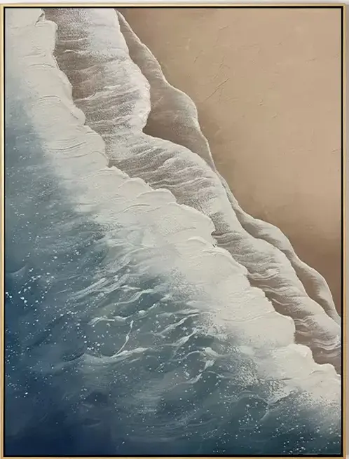
This hand-painted canvas splits the frame diagonally between sculptural white foam and a flat, plaster-like field of taupe sand, with slate blue pooling along the lower edge. It reads as an abstract, tactile seascape that suits coastal, Japandi, and contemporary wabi-inspired rooms, working especially well above a low sofa, a wide headboard, or on a tall foyer wall.
Quick read
A shoreline rebuilt as texture — ridged foam on one side, still sand on the other, meeting along a jagged, hand-worked seam.
Product reference
The first thing you notice about Textured Ocean Shoreline Convergence isn't the ocean — it's the ridge. A raised, hand-built seam of white and pale grey pigment runs diagonally across the canvas, splitting the composition into two clearly different fields. On one side, layered foam pushes forward in sculptural strokes. On the other, a flat expanse of warm taupe sand sits perfectly still, its plaster-like surface catching light unevenly across the plane. Deep navy and slate blue pool along the lower edge, anchoring the piece with quiet weight.
It reads as an abstract seascape, but only loosely. The subject is really edge, tension, and material buildup. That's what gives it staying power on a wall.
What This Piece Actually Is
This is a hand-painted, heavily textured canvas in the 3D organic-modern tradition — closer to sculpted relief than a printed seascape. The white foam side is built up in ropes of raised pigment; the sand side is worked flat and matte. Under daylight, the ridges throw soft shadows and the composition feels almost topographic. Under warm lamplight in the evening, those same ridges soften and the taupe field reads richer, almost linen-like.
If you've been comparing flat coastal prints, framed photography, or smooth abstract canvases, this sits in a different category. It's a tactile wall piece first, an ocean reference second.
How It Reads in a Room
The diagonal pull is the design decision that matters most. It gives the piece movement without noise, which is why it holds up above furniture that's already doing a lot — a long sectional, a wide upholstered headboard, a console with layered objects.
Above a low, linear sofa in a living room, the diagonal draws the eye across the seating area rather than pinning it in place. In a bedroom, hung above a wide headboard, the sandy tones lean into warm wood nightstands and linen bedding. In a foyer with a tall, uninterrupted wall, the texture gets room to breathe and reads clearly as guests approach.
It works less well in tight galleries of small art, or on walls already crowded with pattern. This piece wants space around it.
Who It's For
Buyers drawn to coastal, Japandi, or contemporary wabi-inspired rooms tend to respond to it quickly. The palette — bone white, taupe, driftwood grey, deep navy — sits naturally alongside light oak, bleached wood, warm white linen, and unglazed ceramics. If your room is already restrained and tactile, this piece reinforces that direction instead of fighting it.
It's a poor match for high-contrast modern rooms built on black, chrome, and saturated color. The subtlety would get lost.
A Common Misread
People sometimes expect a literal beach scene and are surprised by how abstract it is up close. The foam doesn't render as water so much as sculpted terrain. That's the point, but it's worth knowing before you buy. If you want a photographic ocean, this isn't that. If you want a wall surface that behaves like a piece of the coast — worn, layered, built by hand — it delivers.
A Quick Styling Scenario
Picture a living room with a low oatmeal sofa, a pale oak coffee table, and a linen floor lamp in the corner. The wall behind the sofa has been empty because nothing felt right. Hang this piece centered above the sofa, roughly six to eight inches above the back cushions. The diagonal moves the eye toward the lamp, the taupe pulls the wood tones forward, and the navy grounds the whole seating group. The room finally closes.
Product Details
- Type: Hand-painted canvas wall art with heavy 3D texture
- Style: Abstract seascape, organic modern
- Palette: Bone white, pale grey, warm taupe, slate blue, deep navy
- Finish: Sculptural raised strokes on the foam side; flat, plaster-like surface on the sand side
- Best rooms: Living room, bedroom, foyer, home office, dining room
- Pairs with: Light oak, driftwood grey, warm white linen, bleached wood finishes
- Interior directions: Coastal, Japandi, contemporary wabi-inspired
- Placement notes: Above a low sofa, above a wide headboard, or on a tall foyer wall facing the entrance
For rooms that lean quiet but want a wall that actually holds attention, take a closer look at Textured Ocean Shoreline Convergence.