

The Quiet Weight of Plaster: Living With Textured Plaster Abstract Quiet Divide
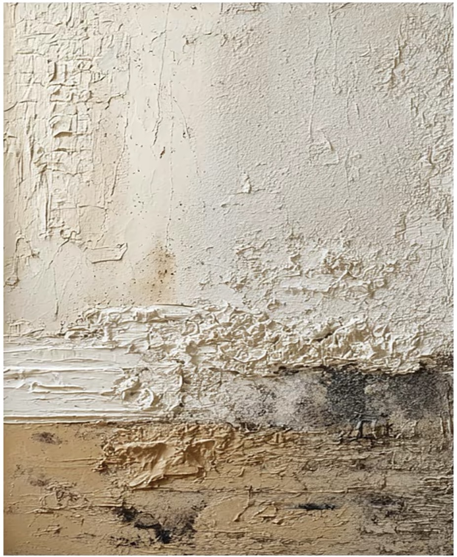
This piece uses three horizontal registers of plaster-like texture — coarse ivory, a ridge of white impasto, and a sand-toned base flecked with charcoal — to create a quiet horizon line that grounds a wall without adding color noise. It works well above a low sofa, behind a headboard, or on a hallway end wall where its surface can catch daylight.
Quick read
Neutral, textural, architectural — a wall piece built for stillness rather than statement.
Product reference
The first thing you notice about Textured Plaster Abstract Quiet Divide is the surface. It doesn't behave like a painting so much as a section of wall — three horizontal registers of built-up plaster-like material stacked into a quiet horizon. A coarse ivory field sits on top, marked with fine vertical striations. A dense ridge of white impasto cuts across the middle. Beneath it, a warm sand-toned base carries scattered charcoal flecks that keep the eye moving.
There's no color story here, no brushwork drama. The composition is entirely about weight, edge, and how light falls across raised and recessed areas throughout the day.
What kind of wall art this actually is
This is a hand-painted, heavily textured canvas — closer to a low-relief plaster panel than a print. The transitions between zones are abrupt, not blended, which is what gives the piece its architectural feel. Think of it as a neutral abstract painting built through layered application rather than gesture. It sits somewhere between wabi-sabi and quiet contemporary minimalism, and it reads as tactile from a few feet away.
How it changes a room
Because the palette stays fully neutral, the piece adds mass without adding color. That's the trade — you get presence and shadow play, not a pop of contrast. In morning light, the ridge across the middle throws a soft shadow line. Under lamplight in the evening, the surface softens and the sand tones warm up. It becomes a slightly different painting depending on the hour, which is part of what makes it worth living with.
The horizontal banding also does something useful: it echoes the lines of low furniture. Above a long sofa or a low headboard, it visually extends the horizontal without competing for attention.
Who it suits
This piece belongs in rooms built around natural materials and restrained color. If your space leans toward light oak, linen upholstery, lime-washed or plaster walls, and a Japandi or contemporary wabi-inspired direction, it will feel at home immediately. If your interior runs graphic, saturated, or maximalist, this won't be the anchor piece — it's designed to be quiet.
It's also a good fit for buyers who are tired of printed canvas art and want something with real surface. The texture is the point.
Realistic expectations
A common assumption with plaster-style abstracts is that they'll read as bold from across the room. This one won't. The composition is calm and the palette is soft, so at distance it functions more as a tonal field than a focal object. Up close is where it earns its keep — the ridges, striations, and charcoal flecks reveal themselves as you approach.
Compared to a high-contrast abstract or a framed print, this piece leans supportive rather than declarative. It's the wall art you choose when you want the room to feel considered, not busy.
A quick styling scenario
Picture a living room with a low, linen-upholstered sofa in warm white, a light oak coffee table, and plaster walls in a soft off-white. The painting hangs centered above the sofa, its horizon line sitting roughly at eye level when standing. The ridge of impasto catches the afternoon light from a side window. Nothing else on the wall. The room reads calm, layered, and slightly sculptural — exactly what a textured plaster piece is meant to do.
Product details
- Type: Hand-painted textured canvas wall art with plaster-style impasto
- Style: Abstract, wabi-sabi, 3D textured
- Palette: Ivory, pure white, warm sand, with fine charcoal flecking
- Surface: Layered, tactile, architectural; abrupt transitions between bands
- Best rooms: Living room above a low sofa, bedroom behind a low headboard, foyer above a narrow console, dining room, or home office
- Pairs well with: Light oak furniture, warm white linen, soft sand upholstery, lime-washed or plaster walls
- Reads best as: A quiet focal point, not a high-contrast statement piece
If you want a wall that feels considered rather than decorated, take a closer look at Textured Plaster Abstract Quiet Divide.