

The Quiet Drama of a Sculpted Wave: Inside the Textured Wave Seascape Drift
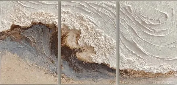
Textured Wave Seascape Drift is a hand-painted triptych that translates a cresting wave into layered plaster, cream ridges, and bronze-grey undercurrents. Built for long walls above sofas, headboards, or a desk-facing wall, it reads as sculpted rather than painted and pairs naturally with light oak, linen, and the quieter side of coastal or Japandi interiors.
Quick read
A wave rendered in plaster, not paint — heavy at the crest, calm at the tideline.
Product reference
Textured Wave Seascape Drift doesn't read like a painting of a wave. It reads like a wave that's been pressed into the wall. Three panels line up horizontally, and across them a crest builds from thick, worked plaster — pale and coarse at the top, tightening into a dark seam of rust, grey, and bronze where the wave folds, then easing into taupe and cream at the base. The dimension is real. Run a light past it and the ridges throw actual shadow.
That physicality is what separates it from a printed coastal canvas. This is hand-painted 3D textured wall art, closer to relief sculpture than to a flat seascape print, and it behaves differently in a room because of it.
How It Reads in a Room
At first glance, the piece feels calm — the palette is quiet, mostly sand, bone, and warm grey. Spend a minute with it and the composition tightens. Tension sits in the middle panel, where the wave compresses into marbled folds. The outer panels breathe. That rhythm keeps the triptych from feeling static, even though the color range is restrained.
Because the surface is textured, the artwork shifts across the day. Morning light rakes across the ridges and pulls out every stroke. Under warm lamplight in the evening, the bronze seam glows and the whole piece softens. It's an artwork that rewards being lived with, not just hung.
Who It's For
This one suits rooms that already lean neutral — light oak floors, whitewashed wood, linen upholstery, soft taupe. It's a natural fit for coastal interiors that avoid literal beach motifs, Japandi spaces where texture does the heavy lifting, and contemporary wabi-inspired rooms built around imperfection and material honesty.
If your walls are already busy with color or pattern, this isn't the piece. It's designed to be a focal point in a quiet room, not a competitor in a loud one.
What People Get Wrong About Textured Triptychs
Two assumptions come up often. One is that a neutral palette means the artwork will disappear — it won't, because the dimension carries the visual weight. The other is that a three-panel format looks broken up on the wall. In practice, the panel gaps read as intentional structure, almost architectural, and they help a wide piece feel lighter above a long sofa or a king headboard.
Compared to a single large canvas of the same width, the triptych format gives you flexibility on spacing and a more contemporary silhouette. Compared to a flat printed seascape, you're trading photographic clarity for material presence.
A Quick Styling Scenario
Picture a living room with a low, linen-upholstered sofa in warm white, a light oak coffee table, and a pair of ceramic lamps. The wall behind the sofa is empty and wide. Center the triptych so the middle panel lines up with the sofa's midpoint, hang it about eight to ten inches above the backrest, and let the outer panels extend past the sofa arms by a few inches on each side. The horizontal spread pulls the eye across the room instead of stacking weight in one spot. Add a bronze or brushed-brass floor lamp nearby and the wave's darker seam picks up the metal.
Product Details
- Format: Three-panel triptych, hand-painted on canvas
- Medium: Heavy plaster and acrylic, built up into real dimensional ridges
- Palette: Cream, bone, warm grey, rust, and bronze, easing into soft taupe at the base
- Finish: Matte, sculptural, shadow-catching — no gloss
- Sizes: Available in linked size options to suit standard sofa, headboard, and console widths
- Best placement: Long walls above low sofas, wide headboards, or desk-facing walls in a home office
- Interior fit: Coastal (restrained), Japandi, contemporary wabi-inspired
- Pairs well with: Light oak, whitewashed wood, warm white linen, soft taupe upholstery
Because each piece is hand-worked, expect small variations in the texture and ridge pattern — that's part of what makes it feel like an object rather than a print.
If a sculpted, tonal wave feels like the right anchor for your space, take a closer look at Textured Wave Seascape Drift.