

A Quiet Horizon: Reading the Mood of a Wabi Sabi Landscape
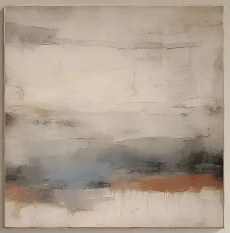
Wabi Sabi Landscape Quiet Horizon is a hand-painted textured canvas that reads as a soft, weathered horizon rather than a scenic view. Its muted palette and plaster-like surface make it a calm focal point above a sofa, bed, or dining end wall, especially in Japandi, wabi-inspired, and soft modern interiors.
Quick read
A landscape that behaves more like a wall surface than a picture.
Product reference
At first look, Wabi Sabi Landscape Quiet Horizon reads less like a scene and more like a wall that has aged well. Loose horizontal bands of ivory, ash, and soft stone drift across the canvas, their edges cracked and uneven the way old plaster settles over time. Low in the composition, a small convergence of dusty blue and clay-orange interrupts the pale field — not dramatic, just enough to anchor the eye.
It's a hand-painted, textured abstract landscape in the wabi sabi tradition: restrained, tactile, and built on layered imperfection rather than gesture.
How the piece reads in a room
The surface is doing a lot of the work here. Real ridges, fissures, and thin build-ups of paint catch light differently through the day. In morning daylight, the whites lift and the clay note warms. Under lamplight, the texture deepens and the piece feels heavier, more grounded. That shift is part of why it holds a wall over time instead of flattening into background.
The horizon line sits low, which gives the composition a settled, unhurried rhythm. It doesn't pull focus the way a high-contrast abstract does. Instead, it stabilizes the space around it — useful above a sofa or headboard where you want visual weight without visual noise.
Who it suits
This one fits buyers leaning toward Japandi, contemporary wabi-inspired, or soft modern interiors. If your room already includes light oak, warm white linen, soft taupe upholstery, or plaster-toned walls, the palette will slot in naturally. It also holds up next to darker wood tones and muted textiles without feeling out of place.
It's less suited to high-gloss, high-color, or maximalist rooms. The piece depends on breathing room. Crowd it with competing artwork or busy patterns and the quiet becomes a weakness rather than a strength.
Focal point or supporting piece?
Scaled generously, it works as a primary focal point — the kind of painting a living room organizes itself around. At smaller sizes, or paired with a low console and a lamp, it becomes a supporting piece that softens a corner without dominating it. Either way, it behaves more like a wall surface than a picture, which is a useful distinction when comparing it against sharper graphic abstracts or traditional landscape prints.
A common misread
Buyers sometimes assume a neutral abstract painting will feel flat in person. This one doesn't, and the reason is the texture. Photos can only carry so much of the ridged, plaster-like build. In the room, that dimensionality is what separates it from a flat print in a similar palette. If you're comparing it to a canvas print or a framed poster, expect noticeably more physical presence on the wall.
A short styling scenario
Picture a living room with a long, low linen sofa in warm white, an oak coffee table, and a floor lamp with a linen shade. Hang the piece centered above the sofa, bottom edge roughly eight to ten inches above the backrest. The horizon line lands near eye level from the seat. In the evening, the lamp raking across the surface pulls out the texture and the clay note glows just enough to tie into wood tones nearby. Nothing shouts. The room just feels resolved.
Product details
- Type: Hand-painted textured canvas wall art
- Style: Abstract, wabi sabi, neutral landscape
- Palette: Ivory, ash, soft stone, with dusty blue and clay-orange accents low in the composition
- Surface: Visible ridges, fissures, and plaster-like build; light-responsive
- Best rooms: Living room, bedroom, dining room, foyer, home office
- Placement notes: Above a low linear sofa; behind a low upholstered headboard; on a dining end wall near wood surfaces; opposite a window for soft daylight
- Pairs with: Light oak, warm white linen, soft taupe upholstery, warm plaster walls
- Interior directions: Japandi, contemporary wabi-inspired, soft modern
For a closer look at scale, texture, and available options, see Wabi Sabi Landscape Quiet Horizon.