

Wabi Sabi Mountain Silence: A Textured Landscape That Reads Like Geology
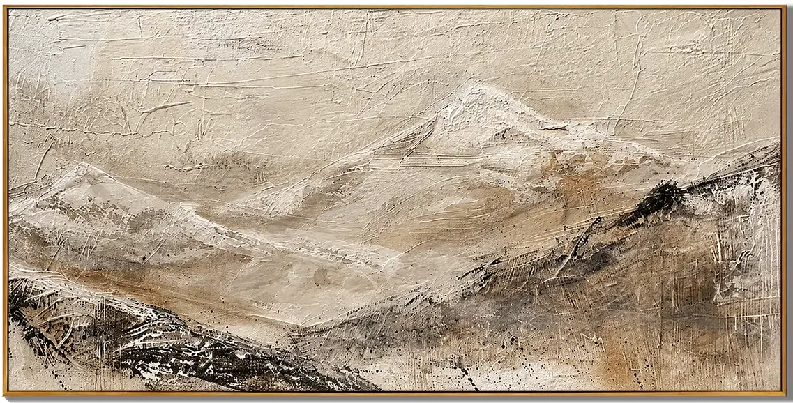
Wabi Sabi Mountain Silence is a wide, hand-painted landscape with a plaster-like surface and a muted earth palette. It behaves less like a decorative print and more like a built-up material object, settling naturally into Japandi, minimalist, and wabi-inspired interiors where texture matters more than color.
Quick read
A horizontal ridge, built up in plaster-weight pigment, holding the room without raising its voice.
Product reference
At first glance, Wabi Sabi Mountain Silence doesn't read like a painting of a mountain. It reads like a slab of weathered material that happens to suggest a ridge. The composition stretches wide, with layered peaks receding into a pale, chalky sky and a darker, charred band gathering along the lower third. The surface is heavily built — plaster-weight texture, fine cracks, tool marks pulled across the ground like sediment.
That tactility is the point. This is a hand-painted canvas where the physical surface does most of the storytelling, and the horizon is almost incidental.
What the piece actually looks like on a wall
The palette stays within bone, sand, and umber, with a quiet charcoal weight at the base. Because the pigment sits in real relief, light catches it unevenly. In morning daylight, the upper half opens up and feels airy. Under warm lamplight at night, the lower band deepens and the ridge softens into shadow. It's the kind of artwork that keeps shifting without ever changing.
Visually, it feels geological rather than scenic — closer to a cross-section of stone than a landscape painting. That restraint is what lets it hold a wall without crowding the room.
How it changes a room
Hung above a low sofa, the horizontal format pulls the seating area together and gives the wall a sense of weight without adding color noise. Above a bed, it reads calmer, more atmospheric, especially against linen bedding and light oak. In a home office, placed opposite a window, the texture becomes the quiet event of the room as daylight moves across it.
It behaves like a grounding piece more than a statement one. The silhouette is wide and slow, so it tends to settle a space rather than energize it.
Who it suits — and who it doesn't
This canvas fits buyers leaning into Japandi, minimalist, or contemporary wabi-inspired interiors — rooms built around oak, taupe, stone, ivory, and natural fibers. It pairs naturally with low-profile furniture, matte finishes, and uncluttered walls.
It's less suited to high-contrast, color-forward rooms or glossy, highly decorative setups. If you want something graphic, saturated, or sharply modern, this piece will feel too quiet. Its value is in restraint, not drama.
Common assumptions worth correcting
- It's not a flat print of a mountain. The relief is real and visible from across the room.
- Neutral doesn't mean weightless — the dark lower band gives it genuine grounding presence.
- It works as a focal point, but a calm one. Expect atmosphere, not a conversation starter.
- The tones shift with lighting, so swatching against a static photo won't fully predict the result.
How it compares to similar wall art
Compared with a standard printed landscape canvas, this piece trades sharp imagery for material depth. Compared with a pure abstract textured panel, it keeps enough horizon to feel like a landscape rather than a surface study. And compared with black-and-white mountain photography, it leans warmer, softer, and more tactile — closer to raw plaster than to ink.
For buyers cross-shopping textured landscape canvas options, the differentiator here is the built-up surface and the restrained, earthen palette working together.
A quick styling scenario
Picture a living room with a low ivory sofa, a light oak coffee table, a linen throw, and a ceramic lamp. The wall above the sofa is wide and bare. Centered there, this canvas pulls the whole arrangement into one quiet composition — the sofa reads softer, the wood reads warmer, and the room suddenly feels edited rather than furnished.
Product details
- Type: Hand-painted canvas wall art, wide horizontal format
- Style: Abstract wabi sabi landscape
- Palette: Bone, sand, umber, with charcoal weight at the base
- Finish: Heavy plaster-like texture with visible cracks and tool marks; matte, light-reactive surface
- Best placements: Above a low sofa on a wide main wall; centered behind a headboard; opposite a window in a home office
- Pairs with: Light oak, warm taupe linen, soft ivory upholstery, stone and ceramic accents
- Interior directions: Japandi, minimalist, contemporary wabi-inspired
For a closer look at sizing and surface detail, see Wabi Sabi Mountain Silence.