

The Quiet Weight of Wabi Sabi Neutral Texture
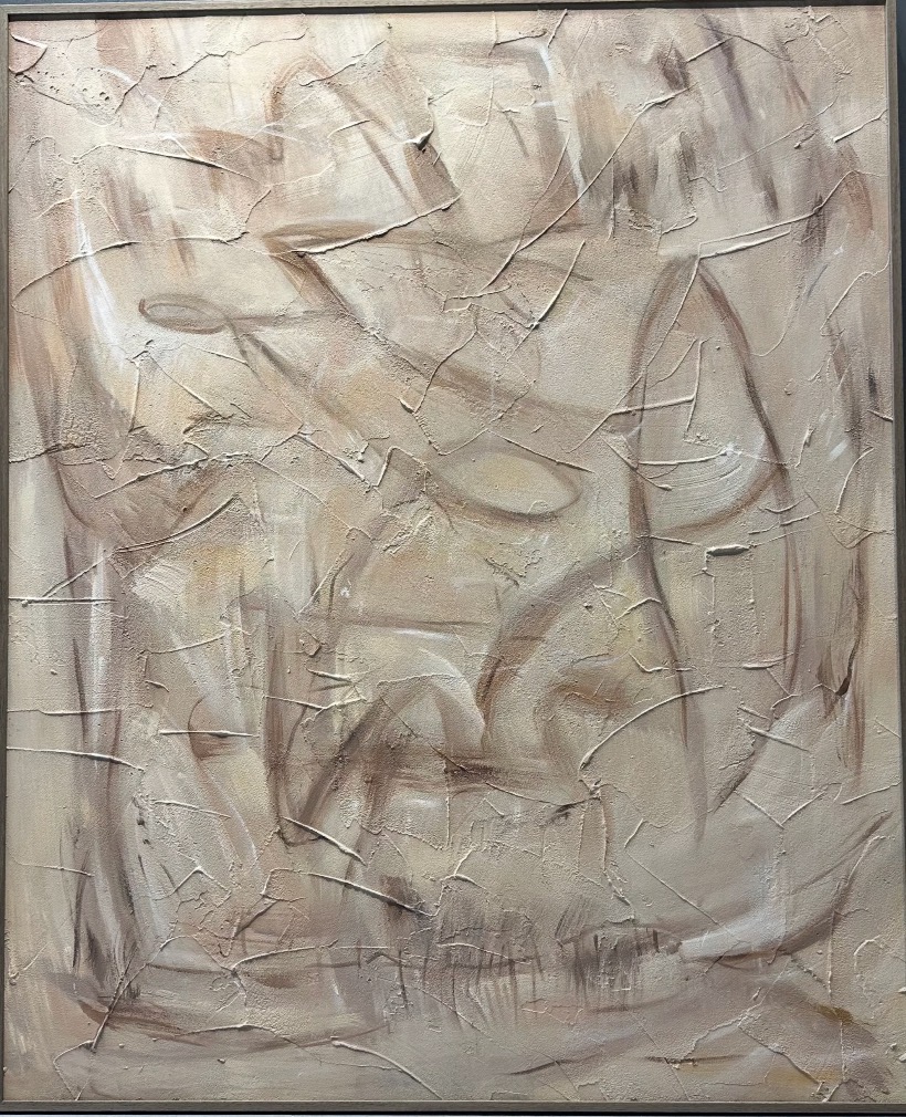
This hand-painted abstract canvas layers chalky neutrals and deep grooved marks into a surface that reads as texture first and image second. It works as a calm focal point above a sofa, bed, or console in Japandi, minimalist, and wabi-inspired rooms where tone and material matter more than contrast.
Quick read
A painting that behaves like a wall, not a picture.
Product reference
At first glance, Wabi Sabi Neutral Texture looks less like a painting and more like a section of old wall someone carefully framed. Ivory, sand, and soft taupe build up in dry, chalky layers, with deep grooves cutting through the raised surface and catching shadow the way cracked plaster does when the light shifts. There is no clear focal point. The tension gathers loosely near the center, then thins toward the edges, letting the eye wander instead of land.
It is a hand-painted canvas, so the texture is physically there — not printed, not simulated. That matters, because the piece earns most of its presence from how it reacts to light rather than from color or imagery.
How It Reads in a Room
The palette stays tight: warm neutrals meeting cooler greys with almost no contrast. That restraint is the point. Instead of pulling attention, the canvas acts as a soft visual anchor, giving a wall weight without adding noise. In daylight, the grooves show their depth and the surface feels sculptural. Under lamplight, the shadows deepen and the piece reads quieter, almost architectural.
If your room already leans busy — layered textiles, mixed woods, open shelving — this works as a steadying element. In a sparer space, it becomes the subtle focal point without ever announcing itself.
Who It Suits
This is a piece for buyers drawn to Japandi, minimalist, or contemporary wabi-inspired interiors — rooms built around light oak, unbleached linen, bouclé, limewashed walls, and warm whites. If you tend to pick artwork for tone and material rather than subject matter, it will feel familiar.
It is probably not the right choice for rooms that rely on bold color, graphic contrast, or a strong narrative image. Next to a saturated painting or a high-contrast photograph, its surface quality can get lost.
A Realistic Styling Scenario
Picture a living room with a low linen sofa in warm oatmeal, a light oak coffee table, and a floor lamp with a paper shade. Hung centered above the sofa, the canvas sits into the room rather than above it. Guests notice it on the second or third look, usually when the afternoon light rakes across the surface and the grooves start to throw shadow. That slow reveal is the piece doing its job.
The same canvas behind a headboard adds quiet mass without introducing new color. In a foyer opposite the entry, the texture unfolds as someone walks closer — a nice detail for a wall people only ever see from a distance otherwise.
Common Misreads
Two assumptions worth adjusting. First, neutral does not mean flat. Photos tend to compress the surface, so the actual depth of the grooves and the shift between warm and cool tones reads stronger in person. Second, this is not a background piece in the dismissive sense. It carries a wall; it just does so without theatrics.
Product Details
- Type: Hand-painted canvas wall art, built with layered pigment and raised plaster-like texture
- Palette: Ivory, sand, soft taupe, warm neutrals with cool grey undertones
- Finish: Dry, chalky surface with deep grooves; matte, non-reflective
- Best rooms: Living room above a low sofa, bedroom behind the headboard, foyer facing the entry, home office opposite a desk, dining room above a console
- Pairs with: Light oak, raw wood, unbleached linen, bouclé, warm white walls
- Style direction: Wabi-sabi, Japandi, minimalist, contemporary neutral
- Placement note: Hang where natural or directional light can graze the surface — side light reveals the texture best
For readers weighing a calm, material-driven focal point over a bolder graphic canvas, explore Wabi Sabi Neutral Texture to see how its surface and palette translate into your own space.