

The Quiet Weight of Stone: Inside the Wabi Sabi Stone Grid Mosaic
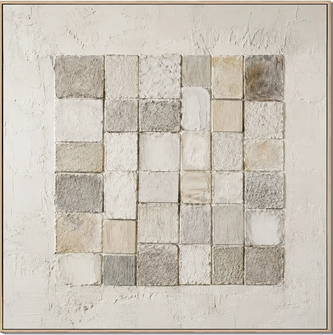
Built from a grid of hand-formed tiles in ash grey, bone white, soft taupe, and faint ochre, this textured canvas behaves less like a painting and more like a wall surface. It settles above consoles, sofas, and dining tables in neutral, material-driven interiors, adding depth without demanding attention.
Quick read
A composition of restraint — small squares, honest texture, and a palette borrowed from old stone floors.
Product reference
At first glance, the Wabi Sabi Stone Grid Mosaic looks less like a painting and more like a piece of old wall someone carefully framed. Rows of hand-formed tiles sit in a loose grid across the canvas, each square slightly different — some chalky and matte, some sandy and coarse, a few catching light where the plaster was pulled thicker. The palette stays in a tight neutral range: ash grey, bone white, warm taupe, and the occasional whisper of ochre.
There is no focal point, no gesture, no dominant shape. The composition works through rhythm and repetition, which is exactly what makes it feel calm on a wall.
What kind of wall art this actually is
This is hand-painted, 3D-textured canvas art built in the wabi-sabi tradition — meaning the surface is intentionally imperfect, with visible joints, irregular edges, and tonal shifts between tiles. It belongs to the same visual family as plaster art, stone-effect wall decor, and minimalist textured canvases, but it reads more architectural than decorative. Think of it as a quiet material study rather than an abstract composition.
The grid structure keeps it orderly. The handmade variation keeps it from feeling cold.
How it changes a room
Flat art tends to sit on a wall. This one sits with it. Because the tiles catch light at slightly different angles, the piece shifts throughout the day — crisper and more sculptural in morning daylight, softer and almost monochrome under warm lamplight. In rooms with plaster walls, limewash, or raw wood, it blends into the material story instead of competing with it.
It is not a statement piece in the loud sense. It is a grounding piece. The kind of art that makes a room feel more considered without anyone being able to say exactly why.
Who it suits — and who it doesn't
This mosaic is a natural fit for Japandi, contemporary wabi-inspired, and quiet minimalist interiors. It pairs easily with light oak, travertine, unlacquered brass, linen, and warm taupe upholstery. If your home leans toward natural materials and a slower, tonal palette, it will feel immediately at home.
It is a weaker fit for high-contrast modern spaces, glossy finishes, or rooms built around saturated color. The piece needs breathing room and soft surroundings to do its work. Hung in a busy gallery wall, it loses its quiet.
A realistic styling scenario
Picture a foyer with a narrow oak console, a stoneware bowl, and a small ceramic lamp. The mosaic hangs centered above the console, roughly six to eight inches above the surface. From the doorway, it reads as a textured panel — almost like a section of exposed interior wall — anchoring the entry without announcing itself. Swap that setting for a low linen sofa in a living room, and the effect is similar: it holds the wall, lets the furniture lead, and keeps the overall palette intact.
Above a wood dining table, it works as a backdrop rather than a focal point, which is often exactly what dining walls need.
Common assumptions worth correcting
- It is not flat print. The texture is physical — raised tiles, visible joints, varied grain.
- It is not purely grey. Warm taupe and ochre notes keep it from reading cold.
- It is not a bold centerpiece. It performs best as a quiet anchor, not a conversation starter.
Product details
- Type: Hand-painted textured canvas wall art
- Finish: 3D plaster-style tiles with mixed matte, sandy, and lightly sheened surfaces
- Palette: Ash grey, bone white, soft taupe, faint ochre
- Composition: Grid of hand-formed squares with irregular joints
- Best rooms: Foyer, living room, dining room, home office
- Pairs with: Light oak, travertine, linen, unlacquered wood, plaster or limewash walls
- Interior directions: Wabi-sabi, Japandi, minimalist, contemporary neutral
Because each piece is hand-worked, expect small variations in tile shape, texture depth, and tonal distribution — part of what gives the surface its handmade honesty.
For readers building a calm, material-driven interior, the Wabi Sabi Stone Grid Mosaic is worth considering as the quiet backbone of the room.